
Understanding and interpreting data is crucial, whether you’re a government analyst, a business professional, a researcher at a university, or a sports enthusiast. We all collect a wealth of data on various subjects to gain more information and better understand the topics we care about. However, the challenge often lies in making sense of this sea of numbers.
The Importance of Visual Representation
The first rule in statistics is: draw a picture. Visual representations such as graphs can reveal patterns, relationships, and other important features within data. While statistical analysis involves numbers and formulas, visualizations provide an intuitive understanding of the data. A picture can convey insights about the midpoint, spread, shape, and patterns of the data.
For instance, graphical representations can indicate the distribution of a variable, highlight unexpected outliers, or describe an association between two variables. These visual tools serve as effective communication tools to share the stories embedded within data.
Characterizing Distribution
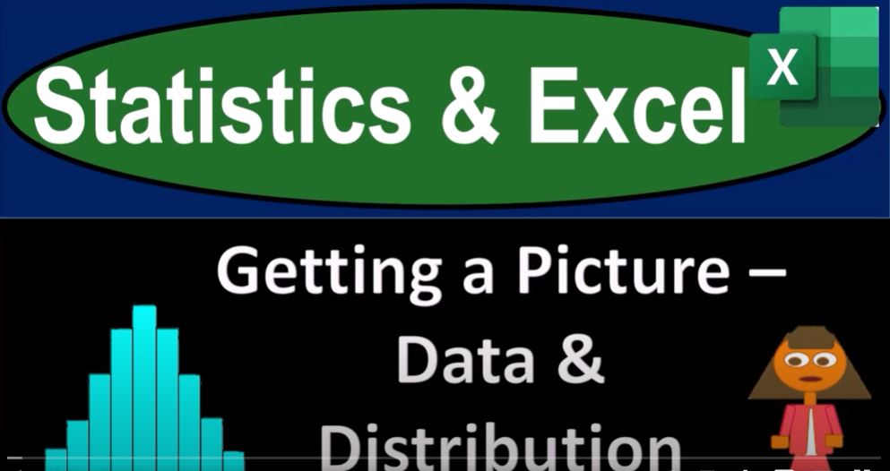
A crucial aspect of understanding data involves characterizing its distribution. This typically involves identifying the general shape (e.g., bell-shaped or bimodal). Usually, we think about a histogram here, which looks similar to a bar chart. Histograms can approximate shapes like the standard bell curve, show skewness, or indicate bimodality.
Finding the Center of the Data
One key goal in statistics is finding the center point of the data and measuring how spread out or concentrated the data is from the center. This involves using statistical measures such as the mean and median and understanding the spread around these central points.
Organizing and Summarizing Data
Statistics aim to effectively organize, describe, and summarize data. This process involves:
- Ordering Data Usefully: Sorting the data from lowest to highest values.
- Grouping Data Efficiently: Compiling data into groups for better analysis.
- Summarizing Data with Single Numbers: Using measures like the mean or median.
- Identifying Quartiles: Breaking the data set into quartiles.
- Creating Graphical Representations: Using tools like histograms and box plots to visualize data.
Histograms and Box Plots
A histogram is created by dividing the data into disjoint groups and counting the frequency of data items within each group. This reveals the shape of the data, indicating whether it’s skewed, bimodal, or symmetrical. Box plots are another tool that can help summarize data effectively.
Examining Relationships
A fundamental part of extracting meaning from data is examining the relationship between two or more variables. For instance, one might look at the correlation between a student’s LSAT score and their GPA in college. Such relationships can be visualized using scatter plots, with each dot representing an individual’s specific combination of variables.
Avoiding Misinterpretation
It’s important to remember that correlation does not imply causation. While a scatter plot can show a relationship, it doesn’t necessarily mean one variable causes the other. Misinterpretations can occur if the causation is assumed or if the relationship is represented inaccurately.
Conclusion
The ultimate goal of statistics is to organize, describe, and summarize datasets to understand them better. We often look at data’s distribution, shape, center, and spread using graphical tools like histograms and box plots and statistical measures like mean, median, and quartiles. However, we must be mindful of how data can be misrepresented and avoid the pitfalls of over-categorization and bias.
By using Excel and understanding these statistical concepts, we can effectively analyze and visualize data, helping us make informed decisions and share insights with others.