
In this presentation, we will create an accounts receivable graph within QuickBooks Pro 2020 QuickBooks desktop 2020. Here we are in our get great guitars file we currently have the open windows open, we can open the open windows by selecting the view drop down and the open windows lyst.
0:18
We’re now going to be considering an accounts receivable graph whenever we think about any graph or report, other than the major financial statements balance sheet and income statement, we want to consider what account and which of those financial statement reports are going to be supported with the report or graph we are running. In this case, accounts receivable will be a balance sheet account.
0:38
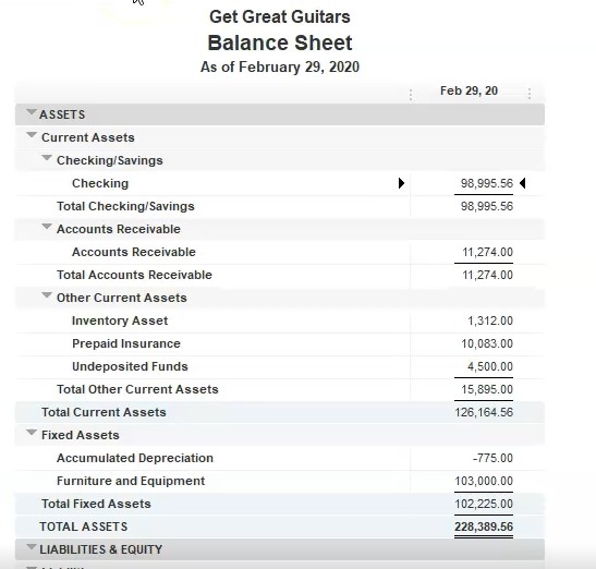
Therefore, let’s first open the balance sheet we’re going to go to the reports drop down up top, I’m going to go to the company and financial and scroll on down to that balance sheet standard report the balance sheet standard report we’re going to take the date as of Oh to 29 to zero in February. Remember the balance sheet is as of a point in time accounts receivable is of course, right here that represents money that is owed to us by customers. So now we want to think about the accounts receivable report, which will break out what is owed to us by customer.
1:08
Also note, we could run another report that would help to support this detailed that being Of course, of report we’ve seen in the past reports drop down. If we go to the customer and receivables we’re looking at the customer balance Summary Report. And that will give us our customer balance information. And in a summary format, we’re at 10,009 74. If I change the dates up top 202 29 2020 229 to zero, we’re at the 11 to 74. If we go back to the balance sheet, we’re at the 11 to 74.

1:44
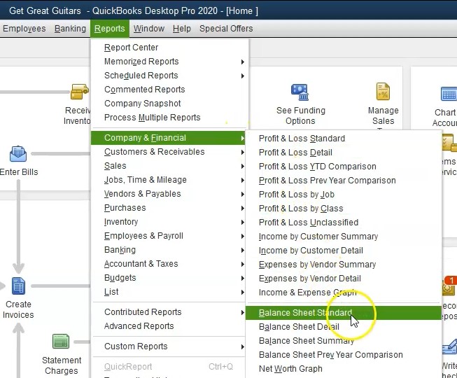
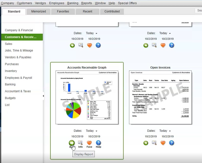
Next, we’re going to run the graph, a couple ways we can get there, we can go to the reports drop down and we can go to the customers and receivables and find the graph here. Or we could use the report Center by going to the reports drop down and the report center. So let’s go into the report center. We’re in the standard tab, I’m going to maximize the sheet by selecting the maximize tab here. And then on the left hand side, we want the customers and receivables within the customers and receivables.
2:12
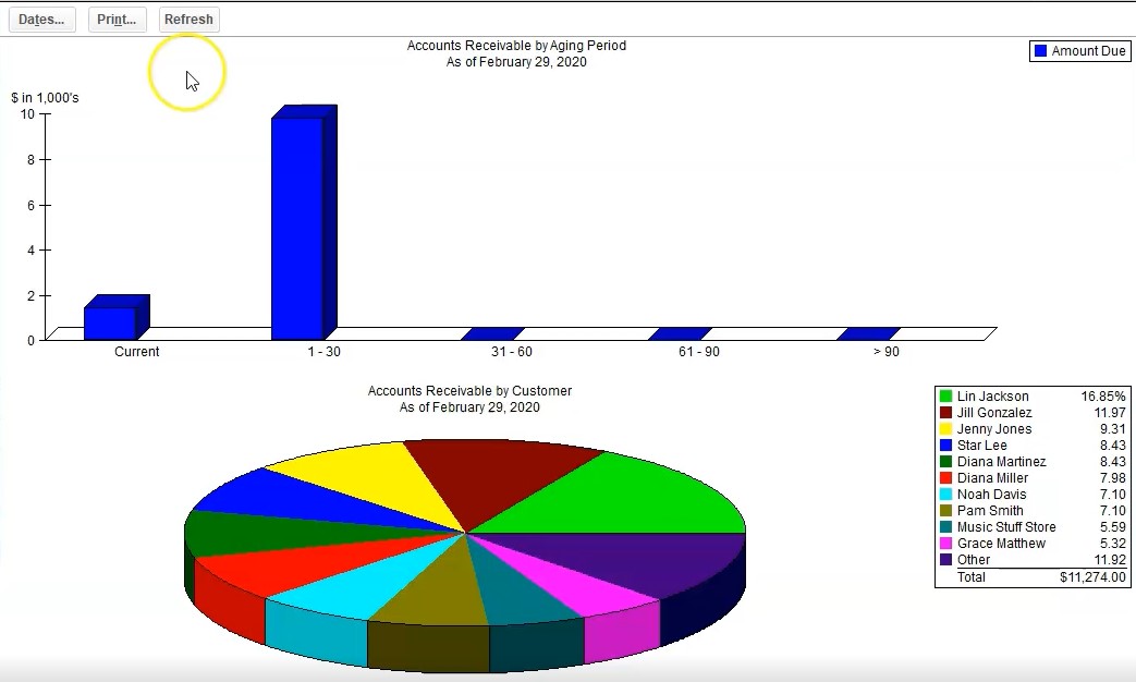
I’m going to scroll down till we get to our graphs. Here’s the accounts receivable graph, we can run the report, we can change the dates on the report I saw I choose I usually will simply run the report so I’m going to run it, then we’ll change the dates on it, nothing’s here. Is it a date problem? Yes, it is we’re going to go back up top and change the dates for it.
2:32
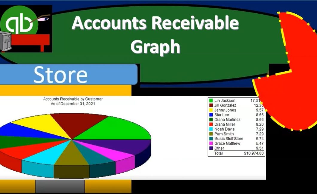
Change the date to go to 20 920 noting once again that it’s going to be at the end of February. And there’s only one date because it is as of a specific point in time, how much do people owe us who owes us as of this point in time, we have the key to the right, which is going to be listing the people that owe us which are going to be customers. And then of course, the graph in the middle of the pie chart for us the total been adding up to the 11 to 74 that then matching what’s up on the balance sheet back to the balance sheet, we see the 11 to 74. If we go back to our graph, then we can take this number note we can create this graph.
3:10
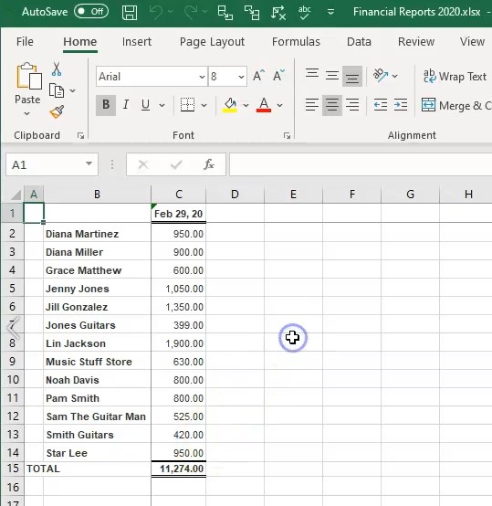
How is this graph created? Well, if we were to take the customer balance summary report back to the customer balance summary in the open windows, export this to excel, we can see how to basically create this graph in Excel if you want to use that and make your own graph and make it a little bit more flexible in that format. Let’s do that. And then we’ll copy and paste the graph from QuickBooks and see how we can use those items as well.
3:35
We’re going to go to the Excel laptop, we’re going to create a new worksheet, we’re going to put that new worksheet into an existing workbook when we have created in the past, and we’re going to select the browse, there’s the workbook we want going to double click on it, we will then export to in here is our Excel worksheet, we’re going to do our normal kind of formatting, I’m going to go all the way to the left, we’re going to click on this screen with the instructions, right click on it and delete it, then I’m going to say delete, I’m going to go all the way to the right, then I’m going to pick up this new sheet, I’m going to pull it all the way to the right, I’m just going to drag it left clicking on it to the right, then we’re going to do some formatting in the Page Layout tab, I’m going to go to the Page Layout View, I’m going to say okay, we’re going to go to the View up top so we can remove the splits there, I’m going to go to the View up top windows group and remove the splits, I’m going to double click then on the name, I’m going to call this and ARAGR graph, let’s just say accounts receivable graph, that’s what we’re going to be making from this. Now note, we might want to read rename the title up here, like I haven’t done in the prior ones, this is going to be a bar graph, you know, and that’ll be on the title.
4:46
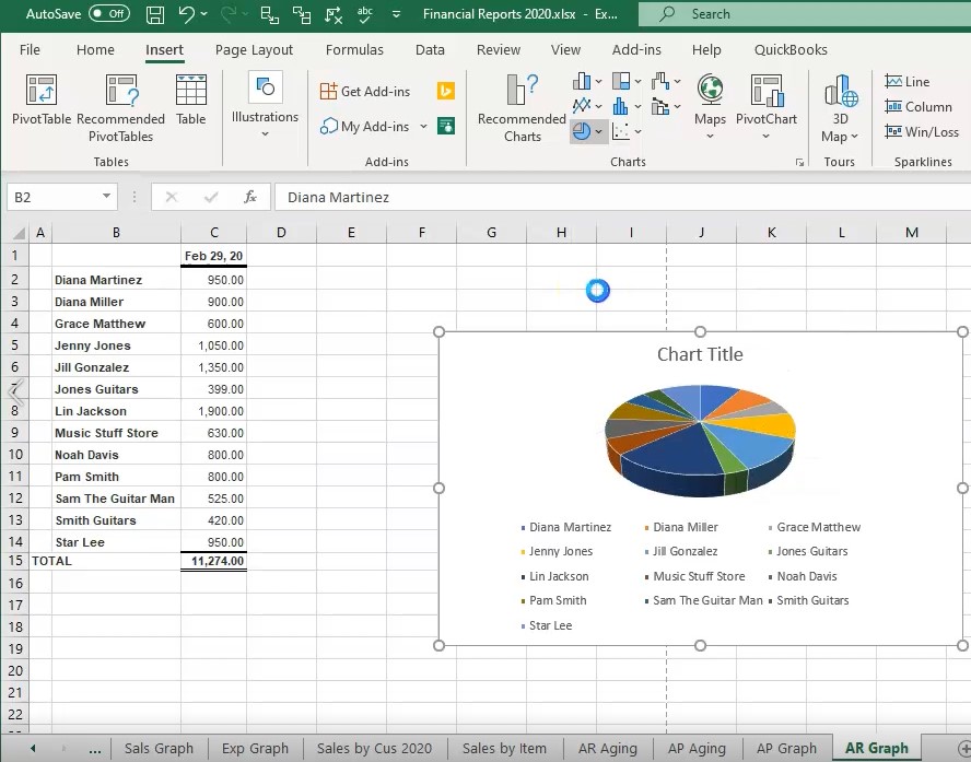
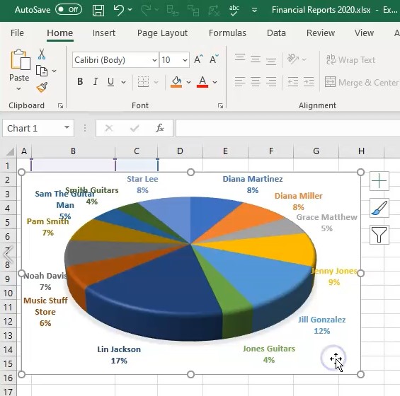
And then I’ll go back over here and back not there, but back here. And then we need to basically make our graph. So all I have to do is highlight these numbers, then go to the Insert. And then we go to go, we want a pie chart, we’ve been making these 3d pie charts. So we’ll make that one. And there we have it. So that’s another format. Another way you can make the graph, you could rotate the graph, you can put a name up to up top, or you can delete it, you can then put the percentages into it if you if you so choose by formatting the graph.
5:17
So for example, if I chose a different format, it might it’ll look something like this, we could put the percentages in here again, you’d have to mess with it to get it, you know, to look as nice as you would like it. Let’s go back up top and go to the the first one here, I’m going to go back up top and select this one here. And then we can adjust these around and make this look as nice as much nicer. But there’s a lot of different formats, we won’t go into all the formatting in Excel here. But in any case, I’m going to put this down below. So we’ll put it below the data.
5:48
Now also know you might want to hide the data in some way, if you don’t want to print the data, like there’s a couple ways you could do, you could try to hide the data or you can even you can just hide the font, even if I was to select all of this information, and go to the Home tab, and then go to the color of the font and make it say white. And then I can I can remove basically, I don’t even need this top number, right click here and delete. And I don’t need the total. So I can get rid of that formatting, right click and delete.
6:19
And then you can basically put your graph right on top of the data. And then and then you can actually print this report without, you know showing the data but just showing the graph if you would choose if you so choose to. And then I’m going to put the graph from Excel right underneath it or the graph that we’re going to copy from QuickBooks, let’s go back to QuickBooks. Here’s our graph there, we’re going to go back to excel, just insert that by going to the Insert tab, we’re going to go to the illustration, we’re going to go to the screenshot, and then I’ll take a clipping of it.

6:49
I’ll take a clipping of this graph. So we’ll just pick up that graph. There it is, and then I’ll take a clipping of the key. So I’m going to go below it, I’m going to go to the illustration, going to go a screenshot, we’re going to take a clipping then of the key. So here’s the key will take that up, and that’ll be right below it. And so there is that. So that looks pretty good. Now we’ll print this entire thing to a PDF file will go to the File tab up top, we’re going to go to print, and then we’re going to print it to a PDF file, we’re going to save the existing the entire workbook, we want the entire workbook, which is going to be including 20 pages now, then I’m going to go to the printing up top.
7:30
And then it’s going to be printing those 20 pages, we’re going to see where it wants to go. And here is our dialogue box, we’re going to go into financial statements, I’m going to call this actually, we’re going to be putting this into here, I’m going to double click on the financials, and say save. Yes. So there we have that, then I’m going to go back to QuickBooks, and I’m going to print this one. So we’re going to go to the reports, I’m going to go to the printing up top, we’re going to go then print it to a cute PDF printer and print this item.
8:09
It’ll then get a give us the printing dialog box. We’re going to put this into the financials, and I’m going to pick I’m going to name it then the counts, let’s say accounts receivable graph. There we have it, and then we’ll save that there. And then let’s see what we have in our folder. If we go to section one through four, within I’m going to delete this bottom one, we don’t need that.
8:37
If we go into the financial reports, then we have all these financial reports that we could then put on an email, we could zip it, I could right click on this and zip the files so that we can then send just that zip file in an email or we can send the Excel worksheet, or we could send this PDF file which has everything included in one PDF file so far that we done which includes the balance sheet, the profit and loss, the comparative balance sheet, the summary balance sheet, the income statement, the comparative profit loss, vertical profit and health, vertical analysis, grasp of the expense and sales.
9:17
And then we have the sales by customer summary. We’ve got the sales by item, we’ve got the accounts receivable, we got the accounts payable, aging, then we have a graph, then we have the vendor balance. And then now we have the accounts receivable graph here. Again, we could probably format these graphs a little bit nicer. We certainly don’t want this on the other page here so we can get rid of that. But we won’t go into a lot of detail here. That’s just an example of how you can basically format these in different fashions.