
This presentation we will create an accounts payable graph within QuickBooks Pro 2020, QuickBooks desktop 2020. Here we are in our get great guitars file, we currently have the open windows open, you can open the open windows by selecting the view drop down and then the open windows lyst.
0:18
We’re now creating a graph related to accounts payable. Whenever we think about anything other than the major financial statement reports balance sheet income statement, we want to think about how it will be supporting those major financial statements balance sheet income statement, this one having to do with the profit and loss, I mean, this one having to do with accounts payable, which is going to be supporting an account accounts receivable on the balance sheet.
0:42
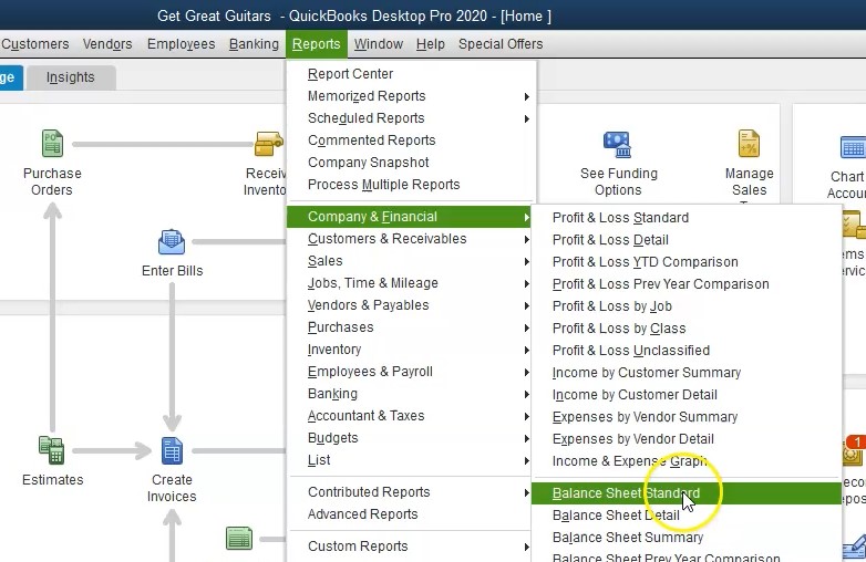
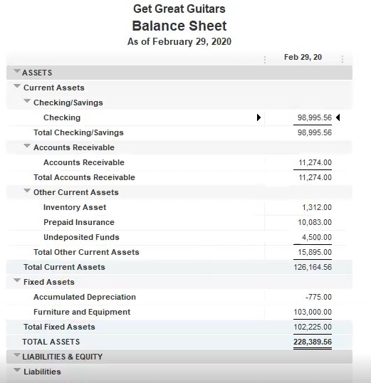
Therefore, let’s open up the balance sheet to first we’re going to go to the reports drop down where they go to the company and financial, we’re going to then go down to the balance sheet standard report, we will then change the date to we’re going to send you 202 29 to zero to 29 to zero, that’s going to be the end of the month. If we scroll down then to the accounts payable, we see the 1200.
1:06
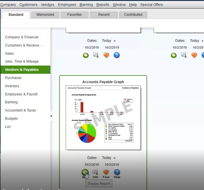
Now this isn’t going to be a very interesting graph, because we only have one vendor involved here. So let’s change this a little bit. So we at least have a couple of vendors, we’re going to say let’s change this to the year end date of Oh 215 to zero, so 215 to zero, we’re going to have the in the middle of the time period. And then if we scroll down, we’re at 1003 68. Let’s see if that’s a bit more interesting of a graph. So then we’re going to look at the graph. So we could go to the graph by going to the reports drop down, we can go to the vendors and payables and then look for the graph there.
1:42
However, typically, when I’m going into the graphs, I would like to see the graphs, I you usually go to the report center, and then I’ll maximize the screen here. We’re looking for the standard, we want to be in the vendors and payables. And then if we scroll down, we’ll see the accounts page graph. That’s the one we’re looking for. We could change the dates here, I tend to just like to open the report, and then change the dates. So I’m going to run the report. Here is our report. It doesn’t show anything. Usually when that happens, we’re going to say well, is it a date problem?
2:14
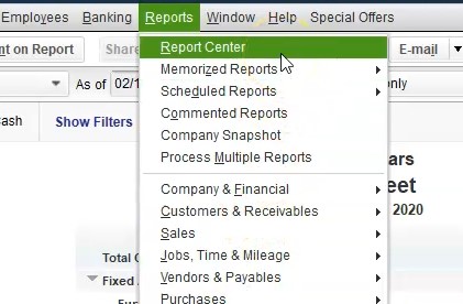
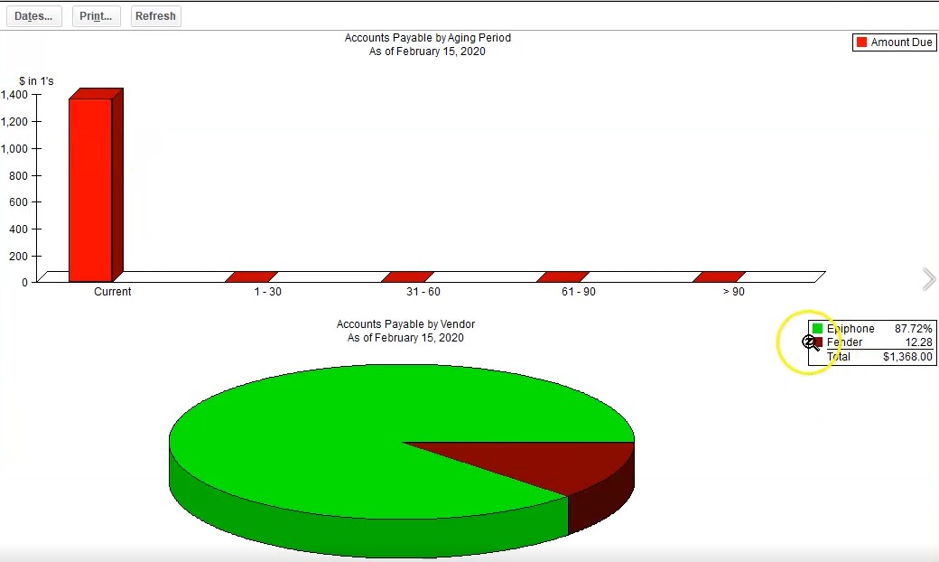
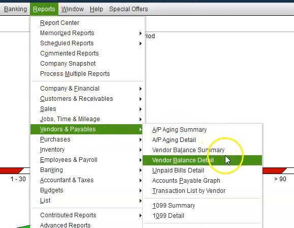
Yes, there’s a date problem, we need to change the date. So we’re going to go up top to the dates. Now picking the dates in the middle of February Oh 215. to zero. To see a more interesting report. Hopefully, at least we have two vendors involved here. So we’ve got the two vendors involved in that one. And that’s going to be our graph for the accounts payable. Now if we wanted to see some more supporting information for this, we could go to the reports drop down, we could go to the vendors and payables.
2:42
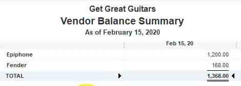
And we could go to the vendor balance summary. So if we go to the vendor balance summary, as of the end of February, I’m going to say as of 215, two zero to 15 to zero, then we have our two reports here. So this is another kind of summary report that we can check in on. There’s the 13868. Here, if we go to the balance sheet, there’s the 1368. There, if we then go to our our graph, then there’s the 1368 here, here’s the two vendors.
3:17
These are the people we purchased from Epiphone and Fender, we purchase guitars in this example, and then sell the guitars from there. Now, we could actually generate this graph fairly, fairly easy for a mock graph like that, if we go to that vendor balance, deep vendor balanced summary, we can export these numbers here, by go into the Excel tab, we’re going to export it to our existing workbook, we’re going to create a new worksheet within it, then we’re going to export it to our existing workbook, going to browse to find it, there it is double clicking on it, then we’ll export to it.
3:55
Here we have it, I’m going to do some of the our normal format, and I’m going to go all the way to the left, I’m going to delete this tab that was created for the instructions, right clicking on it and deleting it saying delete, then I’m going to go all the way to the right, I’m going to grab that tab, which is the sheet one going to left click on it, drag it to the right. So like so and then I’m going to make this a little bit larger, so we can see it a bit easier.

4:20
We’re at 100%. Right now, I’m just going to select the plus button, so it’s a little bit easier to see. Then I’m going to go to the layout to the Page Layout View within the Page Layout, I’m going to say okay, we then have the split pains, I’m going to go to the View tab up top with those split panes and the windows group and I’m going to select the split, that removes the splits, then I’m going to go back to Well, I can rename it, I’m going to actually call this a graph, because that’s we’re going to we’re going to make from it so we’re going to AP graph.
4:53
And then I’m going to go back to the prior screen, and I’m just gonna delete that information we don’t need I don’t need, I don’t need this information that might be useful. Just keep it there. That’s all we need. And then we’ll go to the Insert. And then we’ll go to the actually, and then we’ll highlight these items. Now we’re in insert, charts, and then we’ll go to the graph, we’re going to make a pie chart.

5:17
So that’s the one we want all select that I can grab the end of it and make it a little bit smaller. And so that’s another way we can basically make this graph again. Now the one that we made in QuickBooks, we can also save into our Excel worksheet if we want to make that PDF file with all that information in it by going to the graph here. And then we could go to our Excel worksheet, obviously, you can format this graph and a lot of ways we could change the title in on it, or just delete the title if we don’t want the title there, as well.

5:51
So you can you can then format it in a lot of different ways. We’re going to try to put the other one down below, I’ll put it down below here under the dotted line, so it’s on a new sheet, then I’m going to go to the Insert, we’re going to go to illustrations, we’re going to go to the screenshot, I’m going to make a screen clipping. And then I’m going to clip this graph. So a clip that that are we have it’s it’s over one page, I’m going to make it a little bit smaller. And then I’m going to do the same with the key, I’m going to click on the Insert, illustration, screen screen clipping, then I’ll pick up the key. So we’ll take that want that in there as well. And so there we have that. So now we have this on on our Excel sheet.
6:37
So that’s one way we can do it. Obviously, we can also go to QuickBooks here and we can print this, I’m going to print it as a PDF file. So I’m going to go back up top, I’m going to print, I’m going to print it as a to the cheat to PDF printer, we’re going to say print. And then where’s it going to be located. And we’ll put it into the financial statements. And then I’m going to call this then and AP graph.
7:05
And this is as of actually, oh 215, which is probably relevant information. And then I’m going to say save. And then if we go back to excel, we saved it here as well. Now we can print this report with all our information on it. So we can go to the to the File tab, we can go to print, we can then say I want the entire workbook. So I want the entire workbook which now is 18 pages, I won’t go through them all again. So I’ll go through them after we printed. So we’ll go to the cute PDF printer, we will then print it. It’s now going up to 18 pages.
7:46
And then it’s going to ask us where do we want to put it and I’m going to say that we want to be on the prior tab, it’s going to go into that folder, we’re going to say save it and replace that folder, then we’ll check out what has been created. So within see what has been done, we’re in section one through four. I’m going to delete this one because it’s now a duplicate and it doesn’t have everything in it.
8:10
Now we saved it as a PDF here. So this is our all the PDFs that we have so far that we have created. So we’d have to attach all those if we just want to attach all this to like a monthly worksheet, notice all the reports that we can’t run at the end of a period, we have to decide which ones we want to run, which ones are most relevant and whatnot. Then if I go back here, we could zip this and say let’s compress this, here’s the compressed file.
8:36
We could send the Excel file instead of it if they’re okay with that, or we can send this one PDF file that has all the information in it that was created from the Excel file that includes the balance sheet, the profit loss report, the competitive balance sheet, the summary balance sheet, the income statement, the comparative profit and loss, the vertical analysis, profit and loss, the graphs that we created for the sales graphs and the expense graph, and the sales by customer summary, the sales by item summary the AR aging summary, the APH In summary, the vendor balance detail and obviously we could reformat this a little bit more nicely but these are our graph that we have created.