
0:00
This presentation and we will create an income and expense graph focusing in on the expense graph within QuickBooks Pro 2020, QuickBooks desktop 2020. Here we are in our get great guitars file, we currently have the open windows open, you can open the open windows by selecting the view drop down and the open windows the list we’re going to be focusing in on and expense type of graph, we know that that will be supporting the documentation related to an income statement or Profit and Loss report.
0:28
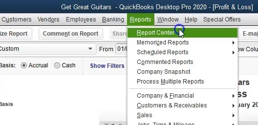
Therefore, we’re going to start off opening up the profit and loss report by going to the reports drop down up top, selecting the company and financial and that profit and loss of standard report, we’re going to be changing the dates up top from a one on one to zero to two, let’s say oh two and 20 920 January through February 2020. Now we’re going to be considering our graph when I go into the grass, I tend to like to go into the report center. Therefore we’re going to go to the reports dropped down to the reports center.
0:58
We’re now looking for the correction I’m going to be in we’re in the standard section, I’m going to maximize the screen here. We’re in the standard tab, we’re in the company and financial tab, and then I’m going to scroll down I typically will just scroll down the reports that are graphs will usually be towards the bottom. Therefore, I’m just going to scroll down till I find the graph we are looking at for scrolling down we see here the income and expense graph.
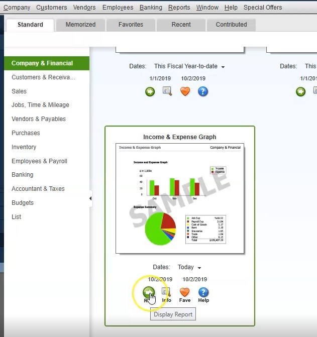
1:25
That’s the one we want. Now we could change the dates, I typically will simply run the report and then change the dates within it. So I’m going to cheat, I’m going to run the report, then there’s nothing there. And I’m going oh no, what’s wrong? Well, it’s a date thing. Anything that time there’s something wrong, don’t panic. First check the dates, is there a date problem? Yes, there is we’re going to select the dates here. And we’re going to change the dates from
1:46
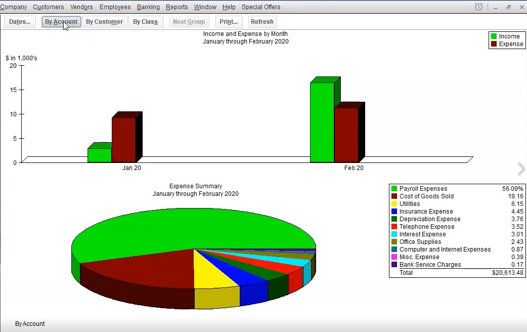
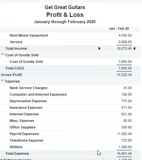
Oh 1012020 229 to zero, that’s January through February 2020. So we’re going to say Okay, there we have our graph. So we have the data up top, we have the graph that is either by account, or by customers. So we got the by account, or by customer or by class, we’re going to be focusing in on the account or customer, you can also change this graph to be an income graph by selecting the income item over here or an expense graph.

2:15
When you select the income side of things, we’re breaking this out, which will be specific related to the accounts that are up top. So we have by account or by customer, we have seen income or sales related graphs in a prior presentation. So we’re going to be focusing here on the expense side of things. But first, we’re going to switch back to the expense over here. So we’re back on the expense side, we’re on the expense side first by accounts expense by account.
2:40
So we see our expenses in the key over here, which of course are represented by the pie chart, we want to consider make sure we know where does that 20,006 13 tie into the profit and loss report. So if we go to the profit and loss report, we could say, All right, here’s the expenses. And there’s the total expenses, it doesn’t tie out, why not, because it also in lose the cost of goods sold. So just recall, just understand that it’s going to be the 1666 3.48 Plus, and then we take the 3950, that’s going to be the 20,006 1348.
3:15
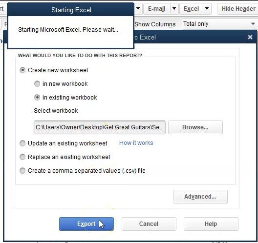
That will be here. So we have the 20,006 1348. So so you can obviously basically generate this report as well from an essence of profit and loss report. So let’s do that real quick just to see what that would look like if we actually export this profit loss report to our Excel worksheet. Once again, if we go to Excel, and we create an Excel, a new Excel worksheet, we’re going to put it to the existing workbook. So we’re going to put that in the existing workbook, I’m going to say browse, there’s the workbook, I’m going to double click on that and export to it.
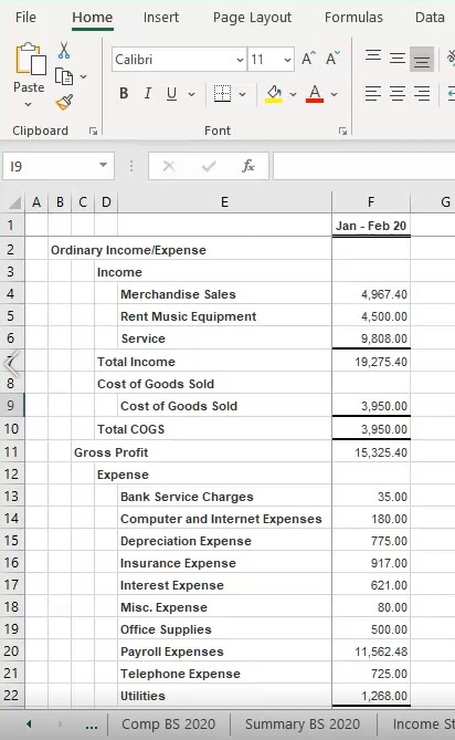
3:49
Here we have it, I’m going to do the same kind of things we normally do, I’m going to delete the prior tab, right click on it, delete it, I’m going to pull this number all the way to the right now I’m going to drag get all the way to the right. And so there we have it, I’m going to rename it, I’m going to call it an expense, graph and expense graph. So we’re going to make an expense graph from this just to regenerate it.
4:13
So you can see how this number is put together. And how you might want to create, it might give you some more flexibility to do. So first off, I’m going to go to the View tab on the second tab, say okay, and then I’m going to get rid of the split pains, we’re going to go to the View up top to do so we’re in the windows group, I’m going to remove the splits, removing the splits, then I’m going to go back to the normal tab. And I’m just going to take what we need, all we need are the expenses.
4:38
Therefore I’m going to delete everything out, I’m going to take the entire row and just go down the entire row highlighting the entire road let go right click on that selected area down to the expenses and delete it, we don’t need any of that. Actually, I’m going to undo that we do need the cost of goods sold, undo, we’re going to go the whole road down to the cost of goods sold. Don’t need the end, then delete, and right click and delete. So now we have the cost of goods sold on down, I don’t need the subtotal.
5:07
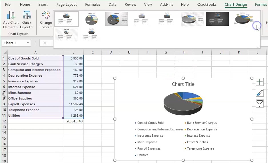
So I’m going to get rid of the sub totals, I’m going to get rid of the expense item here. So I’m going to delete those so that we don’t need any of those. And then I’m going to recreate the total down here. So I’m just going to delete all of this stuff, right click and delete. And so here’s all of our expenses, including the cost of goods sold, I’m going to highlight these three columns. I know I’m doing this fast, but just just an example here, and I’m going to delete this one. And so these are just our expenses now. So if we were to total this up in summing up all of the expenses, we then get to our 20,006 1348.
5:47
Now we can simply make a graph from this, I can just highlight this information, we can go to the Insert tab, we’re going to then go to the charts group, we’re going to make a pie chart, we can do the you know the one with a 3d pie chart. And so there we have it, there’s a 3d pie chart. And obviously, you can, you can adjust it from there. But that’s basically how to how you could set this information where the numbers come from and how you can basically recreate it.
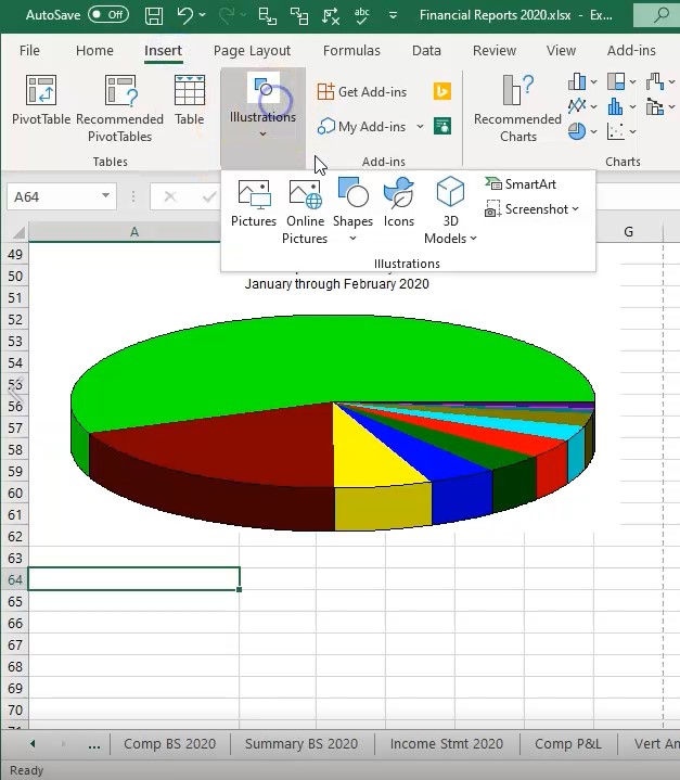
6:14
And then you can, you can do a lot more formatting within Excel of your pie chart in this format, we can also take in a similar fashion as we did before the pie chart that we created in QuickBooks, go back to our chart, and we can then paste it into our Excel worksheet, I’m going to go down to the new sheet because it’s below the dotted line, I’m going to go up top and say, insert, then I’m going to go to the illustration, we’re going to go to the screenshot and take a screen clipping, then I’ll take a screen clipping of this pie chart like that, there we have that and I’ll put the key right underneath it will go to insert will take the screen clipping and we want then the key, take it up the key.
7:00
So these are two ways that you can basically format this information. Obviously, if you have it up here, you can do a whole lot of other things to basically make the key look different and change the colors on the pie chart and all that kind of stuff in that format. So just a couple of ways you can do that. And so now we’re going to go back to QuickBooks, I’m going to save this as a PDF, and then we’ll export the Excel worksheet to the PDF as well. So we’re going to save it, I got to use the cute PDF printer to do that here, I’m going to go to the print up top, we’re going to use the cute PDF printer, I’m going to then say print it.
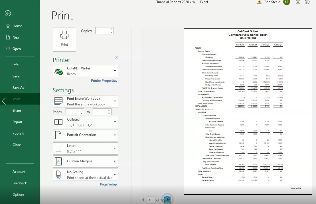
7:34
And then we’re going to get our dialog box. Once again, within the dialog box, going to put it into the financial statements within the financial statements. I’m going to call this the expense graph. So we’re going to say expense graph. So we have that, you could say 2020 might be useful. And we’ll say say that, that’s one way we can save it or now we have it in our Excel worksheet and we can save all the information with one PDF file. If we so choose, we can go to the File tab up top, we can go down to the print item within what the cute PDF printer, we want the entire workbook. So I’m going to select the entire workbook, we didn’t have 12 pages if we scroll through them to see if they look okay, we will do so. And they look excellent so far.
8:21
Let’s get to the graph that’s going to be at the very end here. There’s our graphs, they look very nice. Okay, so now we’re going to go ahead and print this to our cute PDF printer, printing this to the cute PDF printer. And then we have the pop up here to say where do we want to put it, we’re going to put it section one through four, overwrite this file, save it, we’re going to say yes. So here is our information, we’re going to go into section one through four, we can then I’m going to delete the zip file. If I go back into this file that we can either attach all this information to a document to an email or something like that.
9:01
Or we can zip that information, right click on it and zip that information by going down to the send it to a compressed file. Or we can send the Excel file, or we can send this one PDF file which has all the documentation related to it. Here’s what that would look like we’ve got the balance sheet, we’ve got the profit and loss, we’ve got the comprehensive, we’ve got the or the comparative, we got the summary balance sheet, we’ve got the income statement, we’ve got the comparative profit and loss, then the vertical analysis, profit and loss, the sales by customer with the graph, and then we have the profit and loss, we should have changed the report name here to do this.
9:44
So you know, bear with us on that. But that’s the detail the numbers then we’ve got the chart here again, we can change the heading didn’t spend a lot of time formatting this graph to the expense graph. Or we could have simply just taking this information directly from from QuickBooks and just copied and pasted it in this format. So bear with us on these on these last couple to here we could we could spend a lot more time formatting those but there’s just a concept of how you can get it all basically on one PDF file if you so choose for that method.