
This presentation we will create a sales graph within QuickBooks Pro 2020, QuickBooks desktop 2020. Here we are in our get great guitars file, we currently have the open windows open, you can open the open windows by selecting the view drop down and the open windows lyst, we’re going to be taking a look at the sales graph.
0:20
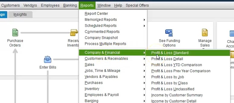
Note that whenever we think about the grass, we want to consider what type of report is supporting in this case, it’s going to be a sales graph. So it’s going to be supporting an account that’s going to be on the profit and loss or income statement. So let’s first open up the profit and loss or income statement. And we’re going to go to the reports drop down, we’re going to go to the company and financial we’re going to go to the profit and loss standard, the profit and loss standard. And then I’m going to change the dates from a 1012020 229 to zero.

0:50
So this is and then obviously our sales are going to be up top we have them broken out between the accounts of the merchandise sales, rent, music, equipment and the service items. Now let’s consider a graph. So a graph related to the sales items. To get to the graph. Usually I go to then the report center, we could go to the graphs from the drop downs, but I like to actually see the graphs that I want to pick up in the report center.
1:14
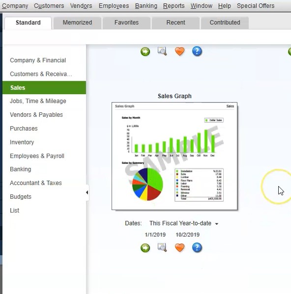
So I usually go to the reports center for the graphs. Then within the report center, we are in the standard tab, the standard tab, I’m going to maximize the report center over here, I’m going to be in the standard tab, we’re going to go down then to the sales. So we’re in the sales items. And I simply just scroll down to I see basically a graph and I like this view that they have set up here, I could scroll down to I find the grass that I want to see. So I’m going to scroll all the way down here is going to be the sales graph that we’re first going to pick up.
1:44
This item will take a look at other graphs and a future presentation, we first want to be dealing with this sales graph, we have the similar kind of options here. As we do for other types of reports. We can change the dates here, here, here, we can put it in the Favorites, and so on and so forth, I typically just run the report, then make adjustments as needed within it. So I will simply run the report. And then we have it doesn’t look that impressive right now. And why doesn’t it look impressive?
1:14
So I usually go to the reports center for the graphs. Then within the report center, we are in the standard tab, the standard tab, I’m going to maximize the report center over here, I’m going to be in the standard tab, we’re going to go down then to the sales. So we’re in the sales items. And I simply just scroll down to I see basically a graph and I like this view that they have set up here, I could scroll down to I find the grass that I want to see. So I’m going to scroll all the way down here is going to be the sales graph that we’re first going to pick up.
1:44
This item will take a look at other graphs and a future presentation, we first want to be dealing with this sales graph, we have the similar kind of options here. As we do for other types of reports. We can change the dates here, here, here, we can put it in the Favorites, and so on and so forth, I typically just run the report, then make adjustments as needed within it. So I will simply run the report. And then we have it doesn’t look that impressive right now. And why doesn’t it look impressive?
2:11
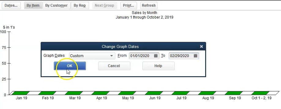
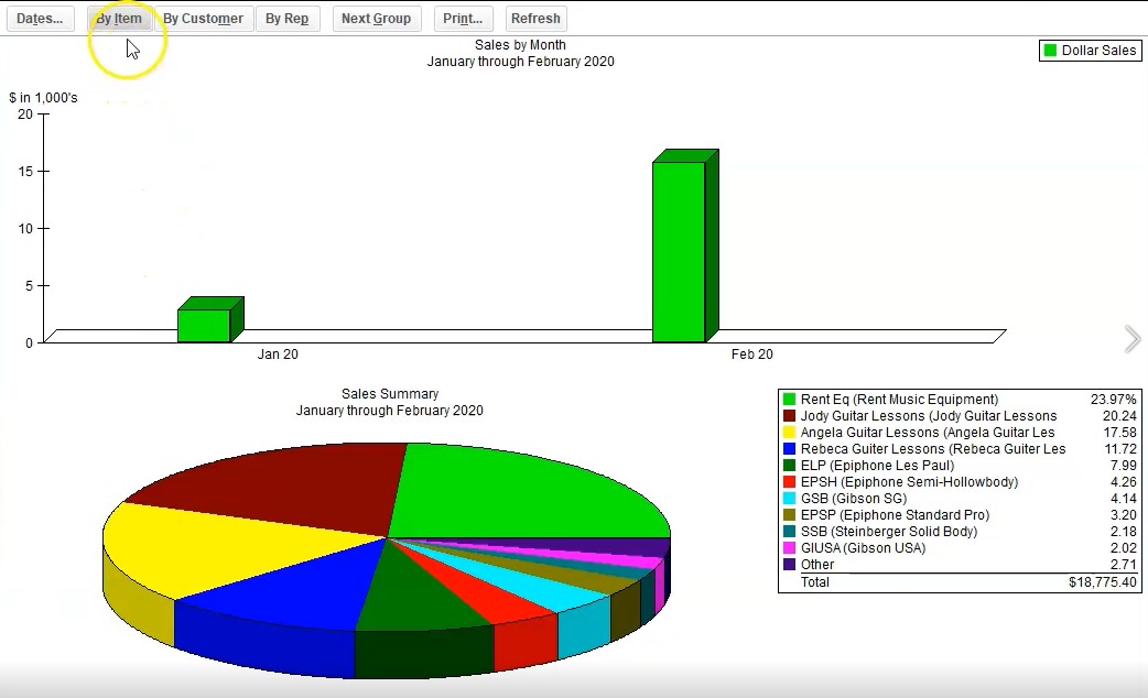
Because it’s at the wrong date range? anytime something doesn’t look quite right. First thing you want to check is the date range correct? What’s going on? Is it a date problem. So let’s say let’s change the dates up top with this little icon up top, we’re going to say dates. And then I’m going to pick up the dates over here to be a 1012020 220 920 January in February, then we’re going to say Okay, and now we have something that looks a little bit nicer, we got our actual graph that we can be working with.
2:40
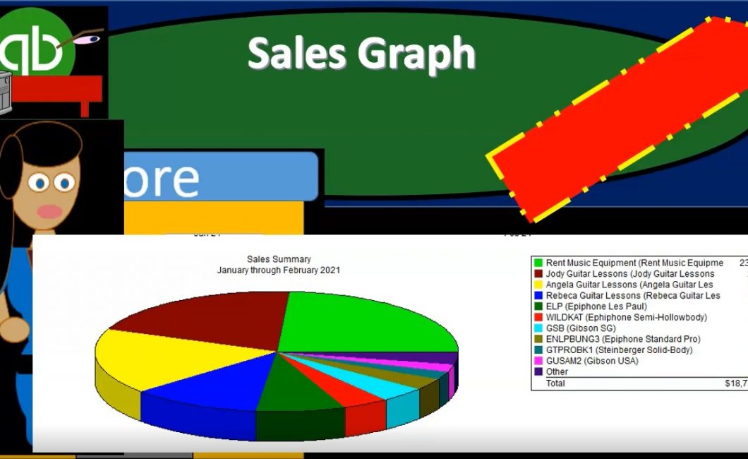
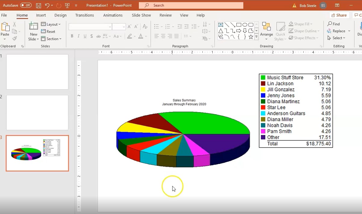
Now this graph is being broken out by items. So where it’s gonna be broken out by item over here, as opposed to by customers, so we got by customer, and then we’ve got by item, if we were to look at the key, then it’s good to know what the key looks like. Because you know, some people will look at it, they actually want to know more about it than just the color of the grass, they might you want to know where it’s going to tie into the financial statements, we have the 18. Notice what we have here. And this is important to do at this point, because there’s a bit of a problem here we’ve got the 1877 5.4.
3:09
And I’m going to subtract that and look at the profit and loss report. If we go back to the profit and loss report, you would think then it would be this 19 to 75. So it’s actually off by the 1927 5.4, the $500. And the reason for that is there’s going to be an adjusting entry, there’s an adjusting entry that was input that’s going to be in the journal entry format. And it’s going to be in the merchandise sales. And it’s going to be this $500, which isn’t adjusting entries, not an invoice or sales receipt, in other words, and that’s what’s throwing it off.

3:43
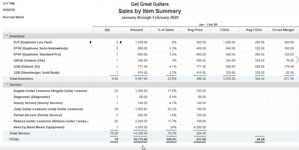
So you kind of want to have to you want to kind of know that going into it here. And we’ll talk about why that adjusting entry is there when we go through the problem. But just note that that is the difference between these two reports. If we go back to the sales graphs here, we can also get these numbers from report up top, which would be the reports up top if we go down to sales. And we looked at the sales by item summary, sales by item summary, we can run the same report, which would be a 101202 to 20 920. And then we get that same 18 775 point four. So this report as well as the profit and loss report, it’s probably something that you want to have available as you present the the kind of graph reports that we would put in place.
4:32
So when we present this graph, we would probably want those two reports just to give that supporting documentation as we give the visual information here. Now, as mentioned before, we can break this same information out same numbers, but we can break it out instead of by item. And remember items or inventory items. So these are the types of things we sell. So we broken those out, we were going to set these items up, when we go into the lists, and we go to the item lists, these are going to be the types of things we sell in in inventory items and service items, closing this back out.

5:03
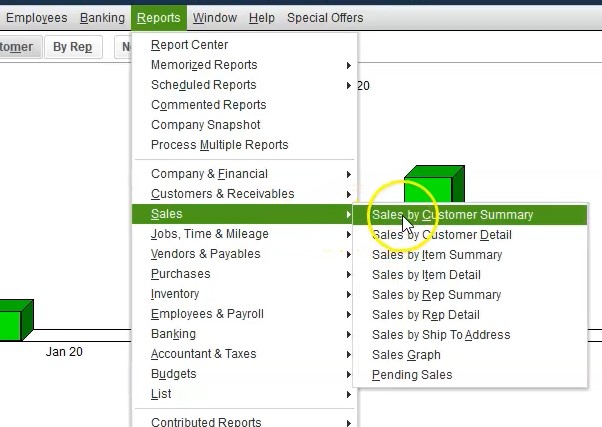
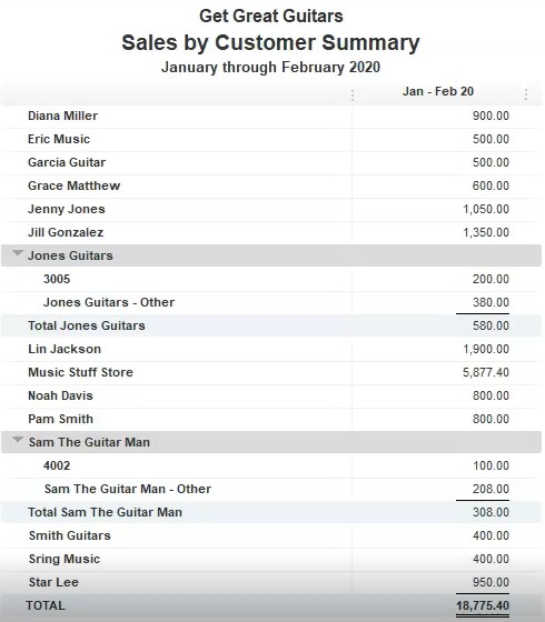
And then we want to consider we can also break this out by customer. So if we go to the customer tab, now we have the same 18 775 point four now broken out by customer, the supporting document here would still be of course the profit and loss in the open windows and we can go to the reports drop down up top, we can go to the customers and receivables. And we want the customer balance actually we want the sales. And then we want this sales by customer summary sales by customer summary. And then if we select the date range to a 1012020 229 to zero, and scroll down, we’re going to get that same 18 775. So that would be the supporting document. If we go back to the graph, then here is our graph.
5:50
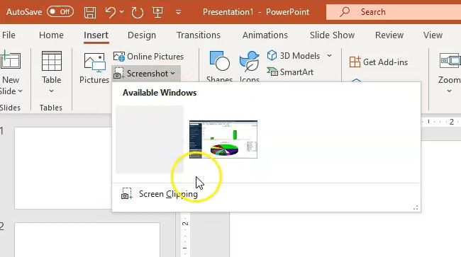
Now we could of course print this graph and put it somewhere, you may want graph like this in a presentation format, however, you might want it like in a PDF file. So note there’s a a couple different ways you can get this into a PDF file, we could go directly to a PDF file and and use the screenshot type of format. So maybe we want to have the the QuickBooks right behind our PDF here. And then I’ll go into the second tab, I’m going to, I’m going to make a new tab by going to the home home. And then I’m going to make a new slide I want to make it just a blank slide. And then I’m going to go to the Insert tab.
6:30
And then in the images area, I go to the screenshot. And then you could take the whole screen, I like to just take a clip in here. And I’ll typically then take a clipping and maybe just one at a Pete one at a time, I’ll clip this. And then maybe I want the key somewhere else, right. And then I can go to the Insert tab again screenshot, take a clipping and then I can pick up the key. And we could take that and then I can maneuver this around the screen, I can make this the key larger if I so choose and make this larger. And we can we could crop it if we want over here using the cropping feature.
7:04
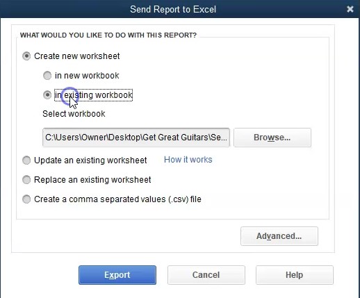
So that’s one way you can get the graph in here, you don’t have the numbers involved if you do it this way. But that’s one way you can kind of easily put together a slide. Now if you want more flexibility with these types of graphs note you can you can actually take these numbers that have been generated here and create an Excel report and actually generate your own graph from it. So for example, let me just how easy that would be you’d go to the Excel, you go to to create a worksheet.
7:30
And then we’re going to create a new worksheet and we can put this into our existing workbook if we so choose, we’ll put it into our workbook, and then export it. So now we’re going to export these numbers into our workbook use it then to create a graph from so here’s our Excel sheet, I’m going to I’m going to pull this to the right same kind of things we need to do within Excel, we’re going to pull this to the right, and then I’m going to go to the layout group, I’m going to say okay, then I’m going to go up top to the View tab, we’re going to go to the windows group and split the pains.
8:05
Then I’m going to go and rename this, I’m going to call this sales graph. And then I’m going to go back to our first sheet. So here’s going to be our numbers for the sales graph. So we got our column of numbers here. And notice we have some totals that we kind of want to remove, we don’t want the totals to be involved, because we just want one set set of numbers. So I’m going to remove the total columns.
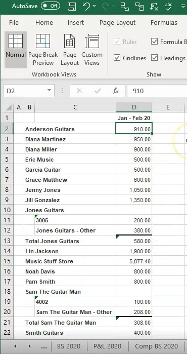
8:33
So I’m going to do that I’m going to remove the total column. So here’s the total for Jones because it has a job. So I’m just gonna take the total, I’m going to read type it up here, it’s gonna be 580. And then I’m going to remove the detail, I’m going to remove this, this and this, it changed the number down here because it’s a formula, but I’m going to right click and delete that. And then I’m going to do the same thing here, this is a total, taking up these three sales, I’m just going to type in the number up here, which is 308. Then remove the detail for Smith, the job related to Smith, and then delete that.
9:06
So now we have one set of numbers here adds up to the 17. And now I’m going to actually just re sum up this whole column, I’m going to delete it, sum up the entire column. And we’re back to that 18 775, that familiar number. Now the next thing we have here is this kind of extra column, because we have the total column. So we just want these to be next to each other. So this column, see, I’m just going to delete the whole thing, I’m going to right click on it and delete it. So now we have just B, and C are two columns. And then I’m going to select all the names and the numbers right next to each other, then go up to the Insert tab.
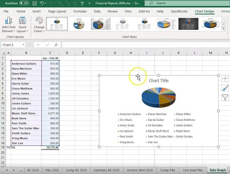
9:46
And then we’re in the charts group, we’re going to make a new chart, I’ll make it one of those 3d charts. And then there’s going to be our 3d chart. And we can adjust then the columns and whatnot. Within within our 3d chart here as well, we can come copy and paste the 3d chart and look at the formatting of it within here. But this is just another option. I’m going to now adjust the Page Layout if I go to the page layout up top. And I’m going to go to this page setup. And I’m going to change the orientation. So I’m going to make it landscape orientation. And then I’m going to try to maneuver this down here so that it will fit. So I’m going to maneuver this, I’m going to put it down below.
10:25
Taking this whole thing, I’m going to put it down below our numbers. So it’s on the on, it all fits on there. Now, we could also basically do the same thing. If we want to have our chart in our Excel sheet, and we just want to copy and paste it, we can do the same type of thing that we did on the PowerPoint point, we can take our chart from QuickBooks, we can go to the graph here, we can then go to excel. And then we can basically take our take our same information, we can insert the information here, we want to go to the illustration, and then the screenshot. And then we could take the screenshot.
11:04
And once again, we could do two screenshots I would typically do with the pie chart here, and then take another screenshot of the key. So then I’ll take another screenshot of the key and take that one here. And there we have that, and I could put that on a new page down here. So it’ll print out on another page. So then if we want to consider what how are we going to print this pie chart, we can go back to QuickBooks, I could print it as a PDF file. Notice there’s no PDF file option I go to print up top, though, and I can print it to a cute PDF printer.
11:42
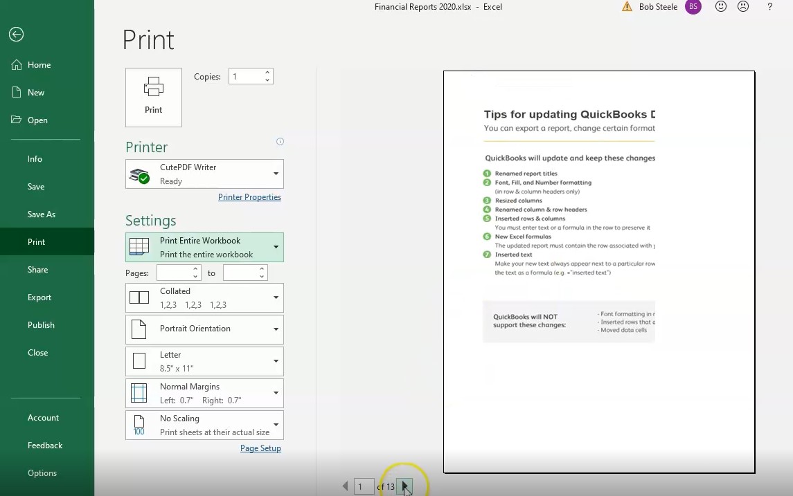
So we can then go print. And then we’re going to be using the cute PDF printer and select that, then I’m going to put it back into our folder, we’re going to say that this is going to be for a sales graph. We’re going to say this is for 2020, let’s say and say save. So we have that in that format. And we basically now have regenerated the graph in a couple different ways in our Excel sheet. So we can also take this Excel sheet then. And we can take this whole worksheet and printed out together with all of our documents by going to the File tab, go into the printing option. And then I’m going to take a look at the entire workbook. So I’m going to go down to the entire workbook. And we now have 13 pages if we scroll now, I don’t want that first page. Let’s go back and delete that one, I’m going to go back, I’m going to go back to the first page, right click on it, delete it.
12:44
Okay, then let’s take a look at it, we’re going to go to the File tab, we’re going to go to the printing options, we’re then going to go to the entire workbook. 10 pages, let’s scroll through it, let’s take a look at what those graphs will look like. For go all the way to the end, we’re going to get two hours new information, which is going to be the graph. There’s our graph. And there’s our second graph. So it looks pretty good.
13:06
We’ll keep that will keep that here. Now let’s print it, we’re going to go ahead and print. And then we’re going to get our dialog box. And so within the dialog box, we’re then going to take this back to section one through four, we’re going to put it into the financial 2020 will save it there. Let’s open it up and take a look at it. If we then open this up, see what we have so far. We’re in section one through four, we could then I’m going to delete this. If we were to give this to someone, we could then take all of these all this information and attach it to say an email or something like that, we could or we could zip the file by right clicking and sending it as a zip file, one file could be easier.
13:52
Or we can send an Excel file or we could send just this one PDF file which has all the reports in it. So on the reports will look like this. Here’s our balance sheet. Here’s our profit and loss. Here’s our comparative balance sheet. And there’s the second half of it. Here’s our summary balance sheet. And here’s the income statement, comparative profit and loss, the vertical analysis, profit and loss. And then here’s our sales by customer summary, including the graph below or the graph that’s generated by QuickBooks that we that we cut and pasted in place.